![]()
![]()
![]()
![]()
![]()
![]()
![]()
Back
to Part 1
In order to enable the
convenient, high-quality setting of Armenian and Latin texts of varying structures,
The MicroFoundry has designed a versatile system
of fonts.
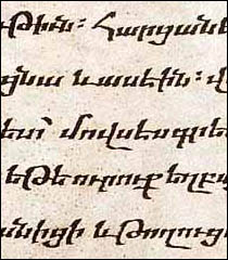
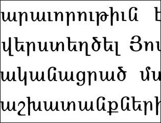
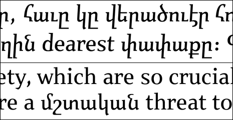
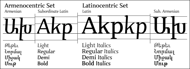
¶Nour is an authentic Armenian
typeface containing a subordinate Latin component (for setting occasional
interspersed text). It can be used in parallel to Patria, a Latin typeface
which in turn contains a subordinate Armenian component. The vertical proportions
of each font have been carefully chosen to maximize true harmony. ¶Nour
and Patria share an overall color and atmosphere, while maintaining cultural
authenticity.
Nours authenticity derives from the standard mediæval manuscript hand, which was in fact the basis of the first Armenian metal types. In contrast, most contemporary Armenian fonts have traded in their authenticity for decidedly Latin features, such as an upright stance and inflated x-height. The unfortunate results are cultural assimilation and reduced readability. ¶With the introduction of Nour&Patria we hope to revive the true Armenian style, but also provide a highly versatile system. Part 3