

![]()
![]()
![]()
![]()
![]()
![]()
![]()
The MicroFoundry has a unique philosophy of Latin type design: functionalist innovation. Thanks to the deconstructive experiments of the past decade, readers expectations are now malleable, and our Latin fonts take advantage of this to radically improve typographic functionality. Relying heavily on research and analytical thought, The MicroFoundrys Latin typefaces defy established conventions in order to achieve purposeful innovation.
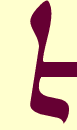
The Daam typeface entity represents an ambitious attempt at improving on the “typeface family” concept. Instead of the one-dimensional emphasis of text through bold or italic styles, the Daam entity allows for the context-sensitive enrichment of text through the use of fonts with varying moods, but of compatible visual character.
Each font in the entity is a “persona” that conveys certain emotions - without disrupting the texture of the setting. Furthermore, a given character has the same set-width in each font, allowing for changes in the emphatics of a text with no effect on linebreaks. ¶There are currently three personas: Brutaal, Cristaal and Domination Available. Over time additional personas will be created, covering the spectrum of human emotions.
Currently in production, TMF Paphos seems a paradox: although born of a purely typographic mindframe, it exhibits somewhat of a handwritten character. The underlying reason is its reliance on irregularity to promote readability. ¶A fundamentally original text design, Paphos nonetheless draws inspiration from five seminal typefaces: Centaur (Jenson), Electra, Octavian, Rotis and Quadraat.