![]()
![]()
![]()
![]()
![]()
![]()
![]()
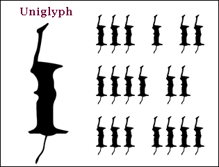
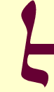
Inspired by the seminal works of Bradbury Thompson, Wim Crouwel and Herbert Bayer, The MicroFoundry has endeavored to simplify the Latin alphabet. After 2000 calculations we arrived at a writing system with one character, the Uniglyph (plus the blank space). ¶In order to make the Uniglyph as absolutely readable as possible, we combined all of the lowercase shapes, weighting them according to their relative frequency. ¶Although Uniglyph makes things much easier for typographers (alleviating the need for type designers), its main appeal is to the reader: since text set in Uniglyph cannot be understood, the reader is totally relieved of the nuisance of reading. Part 2