![]()
![]()
![]()
![]()
![]()
![]()
![]()
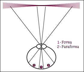
Once mastered, reading seems effortless, and for the reader its beside the point to consider how it actually works. But for a type designer its important to grasp the surprising complexities of reading, and very useful to understand which typographic features promote readability and which ones impede it. ¶When reading, our eyes perform saccades (jumps), fixating on various points along a given line of text. During a fixation, all the information from the retina is used to compile the meaning of the text, and to determine the next point of fixation. The retina itself can be demarcated into the fovea, a small region of high acuity, and the parafovea, a large region where acuity drops off steeply.
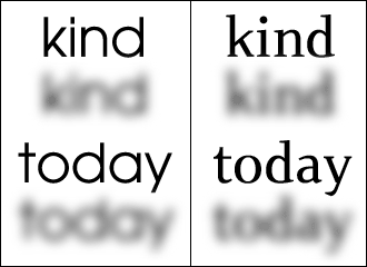
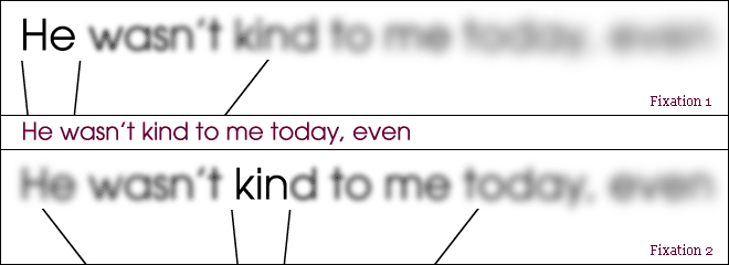
The relevance of the blurry parafovea to the act of reading is fundamental: single letters become undecipherable, so we generally rely on whole words instead. A direct result is that the readability of a font is dependent most on the distinctiveness of sequences of letterforms. ¶In the example on the right, the pronounced modularity and diminutive ascenders of Avant Garde render the word “kind” ambiguous in Fixation 1; this causes a wasteful subsequent fixation upon it. Wasteful, because readability is inversely proportional to the number of fixations performed.
The nebulous shape of a given word is called its “bouma”, and a font which produces more distinctive boumas enjoys greater readability. ¶Bouma distinctiveness depends more on ascenders and descenders than what seems intuitive. This is because conscious judgment relies entirely on direct and deliberate foveal observation, while “immersive” reading does not. What makes individual letterforms most legible isnt necessarily what is optimal for readability. ¶Using the same surface area, the seemingly smaller font on the right produces better boumas. To be continued...